We've updated the visuals around ads on the Google Display Network to help you get better performance.
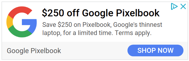
Firstly, text ads are now more than simple text. Ads can now feature a logo when a logo has been added to a creative. Along with increased branding potential, there’s a new font and a rounded call-to-action button. Both changes are intended to align with current design best practices. As these changes roll out, you’ll also begin to see an option to add custom colours, both a main and an accent colour, so that your ads align as closely as possible with your branding preferences.
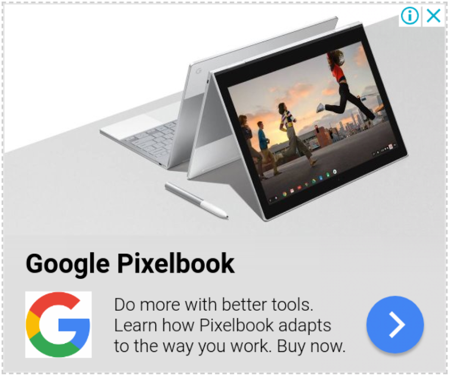
Secondly, the assets for your responsive display ads can now fit together more seamlessly. Using machine learning, colours are extracted from the images which you provide to Google Ads. We create a layout that approximates fully-designed image ads. The colours of the text and button of your ad are all customised to create an appealing contrast for your entire ad unit. The end result should be ads that are content-aware and which closely match the style of top performing human-created image ads.
 |
 |
In order to make the most of these formats, ensure that you’re providing a selection of creative assets to assemble the best possible ads. See our advice about creating effective display ads and read more about responsive display ads
