In this article, we'll share some guidance on making your website more mobile-friendly.
This is part 1 of a 2-part series. In part 2, we'll cover optimizing your ads for mobile.
Before you begin: Why mobile is important
It's important for your website to work well on mobile devices, so if you haven't yet invested in making your website mobile-friendly, it's time to do so. Here are just a few reasons why your mobile presence is critical to your business:
- Mobile-friendly sites show up higher in search results
- Mobile searches make up more than half of searches on Google.com
- For many advertisers, the majority of traffic comes from people on their mobile phones
- If your site isn't mobile-friendly, visitors are 5 times more likely to leave
Is your website mobile-friendly?
Picture yourself as a potential customer and open your website on your phone. How fast does your website load? How easy is it to find what you're looking for?
When someone visits your website on mobile, they'll expect answers right away. They'll want to quickly learn about your business and decide whether they're interested. Their experience on your website will heavily influence their impression of your business and the likelihood that they'll become a customer.
Designing your website for mobile means focusing on simple, clear navigation that connects people to what they're looking for.
Let's look at a few of the elements that make an effective mobile website:
Does your site load quickly? Nearly half of all visitors will leave a mobile website if the pages don’t load within 3 seconds. Minimize loading time (the time it takes for a webpage to show up on your screen) so that visitors can quickly and easily navigate your website.


Is it easy to navigate? On a smaller screen, it can be hard for people to find what they want. The more visitors have to hunt around or zoom in for information, the more likely they'll get frustrated and leave. You can help visitors find what they’re looking for by simplifying your site menu and trying to keep everything visible without having to zoom in to read.

Is it easy to take action? Your mobile website should make it quick and easy for visitors to perform common tasks such as contacting you, searching for a product, or making a purchase. Try to minimize the number of steps it takes to complete a form or transaction.
See how your site scores on mobile speed, and get quick fixes to improve it:
Is your website designed for your specific business goal?
While your mobile website might load quickly and be easy to navigate on mobile, its effectiveness depends on whether it spurs people to do business with you.
To figure out how to optimize your website for mobile, think about the business goal that's most important to you. What do you want your customers to do on your website? Buy a specific product? Fill out a contact form? When you're clear about the action you want people to take on your website, visitors are more likely to actually take that action.
Depending on your marketing goal, you'll want to focus on design improvements that encourage visitors to take your desired action. Here are a few goal-specific suggestions:
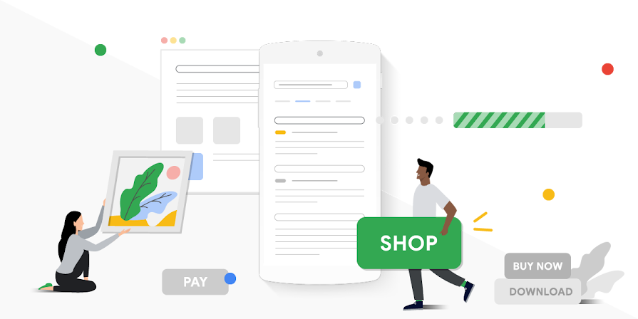
Increase online sales
- Simplify site navigation. Streamline your site menu and try to keep everything visible without having to zoom in to read.
- Make info accessible. Help people explore before they commit to buy by using expandable product images.
- Help people make their purchase. Keep any directions or "Buy now" buttons front and center. If you can, use existing account info to limit data entry for your customers.
- Allow people to resume from a desktop. Make it easy for people to come back to their shopping cart when they're on their desktop computer, so they can finish their purchase.
- Use click-to-call buttons or links. Avoid making people memorize your number or zoom in to see it.
- Condense your menu options. Make sure it's clear that calls are the best way to get in contact with your business. Show a clickable phone number or button on every page of your site.
- Avoid distractions. Keep promotions and other directions to the sidelines so people can focus on how to reach you by phone.
- Simplify your forms. Make sure people can access your forms easily, and that data entry is limited and easy to do with thumbs.
- Limit scrolling and zooming. Your form should only take up the space available on a mobile screen. Scrolling and zooming make it hard for people to avoid mistakes while entering their info.
- Choose your data fields wisely. Make sure the information you're requesting in your form is simple to access and easy to validate. Use validation to show errors for incomplete fields.
- Encourage visits above all. Make it clear that it's best for people to come to your physical store. Show a map, location button, or icon that links directly to your physical address and store hours on every page of the site.
- Keep content limited. Streamline your site's navigation to provide enough information to convince people to visit your store.
- Avoid distractions. Promotions can help convince people to visit your store, but they shouldn't make navigation more difficult.
- Simplify navigation. Use a simple menu and larger text to help people research before they commit to purchase. Because a mobile screen is smaller, condense your menu options so that people don't get overwhelmed.
- Keep consistency across devices. The longer it takes to for a customer to commit to buy, the more likely they are to continue researching on multiple devices (desktop, tablet, phone) before completing the transaction. No matter what device they’re using, help them pick up where they left off by saving their selections.
- Provide a home page link. If someone has hit a dead end in their research, make sure it’s easy for them to get back to the home page to start over.
Working with your web developer
There are different approaches to making your website mobile-friendly, so when it comes to designing and implementing changes, you'll want to work with your web developer to find the right solution.
Most businesses choose to use responsive design, which means creating a website layout that flexibly adapts to different screen sizes, resolutions, and devices. Other business owners prefer to have separate versions of their website for desktop and mobile. We recommend working with your web developer to see what makes the most sense for your business, website needs, and web developer resources.