Google Ads helps large and small businesses around the world reach their goals, from driving awareness to delivering ROI. But thanks to your feedback, we know navigation can be tricky, especially for new advertisers.
Today, we’re testing new designs to improve how the product is organized and make things easier to find—while continuing to provide the same tools and solutions you rely on to grow your business. These changes reflect our ongoing commitment to deepen our understanding of your expressed business goals so we can help deliver better results. This experiment will initially roll out to a small number of accounts.
Please note that we’ll continue to fully support existing features and tools.
We’re testing new designs to improve how Google Ads is organized and make things easier to find
Top 3 changes
While we aren’t changing or removing any of the features you rely on, there are 3 key updates to know about:
1. A new navigation menu
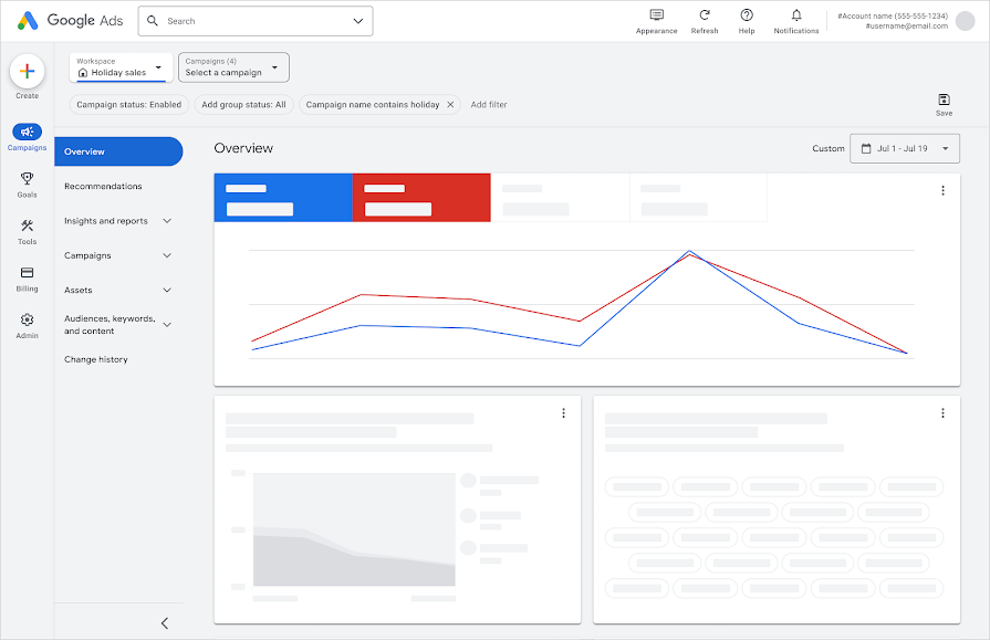
If you are part of these early experiments, you may see a single-level menu or two-level menu in the Google Ads interface. You may see both if you manage multiple accounts.
The redesign lets you access all of Google Ads tools and features from one better-organized menu instead of the three you are used to. The new navigation is more consistent and predictable—menu items don’t move or vanish as you click into the experience, which should make it easier to find where you need to go and know where you are in the interface. There is also a new "Create" button—just click on the “plus” button to easily create campaigns and ad groups from one place.
People in the experiment will either see a single-level menu or two-level menu in the Google Ads interface
2. Reorganized interface
We grouped related tasks together to make tools and features easier to find—once you get used to the change. In particular, we added two new categories to make it clear what matters most to the success of your campaigns. There are no changes to the tools and features covered and nothing is being removed.
Here is a breakdown of the two new navigational categories:
1. Goals
Performance across Google Ads is more goals-driven than ever. We’re elevating Goals in the navigation to make it clear how important setting goals is to steering AI-powered solutions to optimize for the conversions that you know truly drive business outcomes. This new menu category brings together goals and conversion measurement in one place so it’s easier to think about them in a more unified way.
2. Audiences, keywords, and content
The new Audiences, keywords, and content menu category combines the tools that let you define who you want to reach with the tools that let you control how you want to reach them: Search Keywords, Audiences, Locations, and Content. We want to reassure you that there are no changes to Search keyword functionality with this redesign. Search keywords, in particular, are a powerful way to reach relevant audiences, which is why we grouped them with the other tools that help you determine who sees your ads.
You’ll also see changes to what’s grouped within these four menu categories:
- Campaigns
- Assets
- Tools
- Insights and reports, which are now combined
Please visit the quick reference maps in the Help Center for either the one-tier navigation experiment or the two-tier navigation experiment to learn more about these grouping changes. For advertisers using standard Shopping and Hotel campaigns—you will find your hotels, activities, and products under the Assets category. Of course, you can also always find any page directly by searching for it in Google Ads.
3. A refreshed look and feel
We couldn’t reorganize and redesign the navigation without also refreshing our look and feel. There's more white space, so there's less to distract you from the task at hand. A switch from Roboto to our branded Google Sans font and set at a larger size makes for a friendlier feel and improved readability. We also added sleek new icons to the navigation along with a blue highlight so it is clear where you are in the user experience.
Let us know what you think
You can switch back to the original Google Ads experience any time and provide your feedback
We are counting on feedback from people in the experiment which can be shared directly from within Google Ads. The new navigation, reorganized interface and refreshed look and feel are all designed to make it easier to find and do what you need to in Google Ads. When the experiment concludes we will better understand if the changes had an impact and determine if we should roll them out to more users.
Posted by Dianna Wu, Product Manager, Google Ads