| This feature is only available in Google Analytics 360, part of Google Marketing Platform. Learn more about Google Marketing Platform. |
Use the MCF Model Explorer report to visualize and analyze your MCF Data-Driven model. The report shows how your model distributes conversion credit to each of the channels that drive traffic to your website, app, or other digital device. For a definition of the channels shown in the Model Explorer, read About Channels (and the MCF Channel Grouping).
How to use the Model Explorer
The Model Explorer lives in the Conversions > Multi-Channel Funnels reports. Take me there! (Your view must have Data-Driven Models enabled. Learn how to do this.)
The Model Explorer shows you the weighted average credit for the path positions prior to conversion for each channel.1
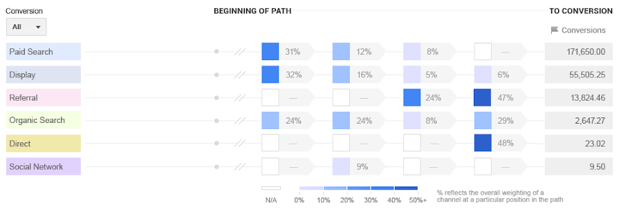
In the screenshot above, you can see a picture of the model weights of each marketing channel along the conversion funnel. The color coding indicates the actual % weight of a channel in a given path location. Darker colors correspond to higher weights for a given channel, whereas lighter colors mean the channel has received less weight in this path location. To give a sense of the overall conversions driven by the channel, you can see the Data-Driven attributed conversions associated with each channel. Some channels, like Direct, might never occur in a given path location; this is represented by a dashed (--) line and a white visual.
This report can reveal interesting patterns of channel weights. It can be used to verify assumptions about the (upper / lower) funnel performance of your marketing channels. For example, Display might help your users identify your brand and start their conversion journey. The weights and colors reflect the importance of your Display efforts along the beginning of the path, to the conversion.
To visualize a specific type of conversion—such as a particular goal—select it from the Conversion selector (above the chart).
The report displays the most recently generated model for the selected date range. You may notice differences in model weights if you change your date range. To tell which week's model you're using, look at the date above the visualization.
Download the full model
The Download the full model button (below the date picker) lets you download the entire model to a CSV file. You can use this to conduct your own analysis. The CSV file will give you the path permutations and the associated weights of your channels within those path permutations.
The downloaded model and the Model Explorer report will most likely not match. This is expected. In the Model Explorer, the data shown depends on the currently selected date range. You can also select the conversion types. The downloaded model, on the other hand, includes conversions from the last 28 days (from the time the model is created, which happens on a weekly basis) and only includes conversions with a conversion path of 2 or more.
1For most customers, the last 4 interactions comprise more than 85% of conversions. You can use the Multi-Channel Funnels Path Length report to see how many of your conversions have a given path length. If you have questions, contact your 360 support team.↑