You can position and scale objects two ways in Google Web Designer: using pixels or using percentages.
- When you use pixels, you specify the exact placement or size of an element.
- When you use percentages, you set the position or size as a percentage of the page (or of the parent element). Percentage-based layouts are often helpful for responsive design.
Percentage-based values
To keep elements positioned relative to the page regardless of viewport size, set position, and size properties using percentages rather than pixels. Percentage values are based on the size of the parent element. For example, when an element's width is set to 50%, the element's size adjusts to continue taking up half of the page width when the page size changes.
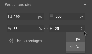
Choose between pixels and percentages
Click the measurement unit (px or %) inside the Properties panel field and select the unit that you want to use from the pop-up menu.
You can quickly switch all position and size properties to percentages by clicking the Use percentages button.