Every element in Google Web Designer has a set of properties, such as size, position, and style. While many elements have similar properties, some elements, such as components, have properties that are specific to them.
You can view and edit properties in the Properties panel.
Common properties
Many elements share these common properties. Some elements may not have the whole set of common properties.
Element ID
Property Description Element Displays the element type. Element types are created by default for each visual element or component. Custom elements can also be created. ID The element ID. Only elements with an ID can be the target or receiver of an event. Position and size
Property Description Left The distance from the left side of the stage (or parent element) in pixels or as a percentage of the total width of the stage (or parent element). Top The distance from the top of the stage (or parent element) in pixels or as a percentage of the total height of the stage (or parent element). Width The width of the element in pixels or as a percentage of the total width of the stage (or parent element). Height The height of the element in pixels or as a percentage of the total height of the stage (or parent element). To choose between pixels and percentages:
Click the measurement unit (
pxor%) and select the unit you want to use from the pop-up menu.You can also change all the position and size properties to percentages by clicking the Use percentages
button.
This option may be unavailable for some element types.
To maintain the width and height ratio:
Click the Constrain aspect ratio
button. When the width or height changes, the other dimension automatically adjusts proportionally.
Click the button again
in order to change the width or height without affecting the other dimension.
Anchoring
Anchoring lets you persistently align elements within a container, even when the element or container's size, padding, or border width changes. Any position or translation properties that you set will offset the element from the anchoring point.
You select a horizontal anchoring mode and a vertical anchoring mode. The default is "top left".
Horizontal anchoring modes
Mode Effect left The left edge of the element aligns to the left edge of the container. center The horizontal center of the element aligns to the horizontal center of the container. right The right edge of the element aligns to the right edge of the container. Vertical anchoring modes
Mode Effect top The top edge of the element aligns to the top edge of the container. middle The vertical middle of the element aligns to the vertical middle of the container. bottom The bottom edge of the element aligns to the bottom edge of the container. Size constraints
Size constraints limit the dimensions of an element, even when the specified dimensions fall outside of the constraints. To remove a size constraint, delete the value so that the field is blank (---).
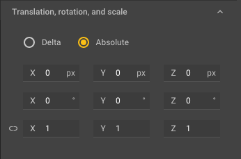
Property Description Min W The minimum width of the element in pixels or as a percentage of the total width of the stage (or parent element). Min H The minimum height of the element in pixels or as a percentage of the total height of the stage (or parent element). Max W The maximum width of the element in pixels or as a percentage of the total width of the stage (or parent element). Max H The maximum height of the element in pixels or as a percentage of the total height of the stage (or parent element). Translation, rotation, and scale
3D value types
Type Description Delta Lets you change the 3D position, rotation, or scale of an object in relation to its current values. Values reset to zero between adjustments. Absolute Displays the 3D position, rotation, and scale of an object in 3D in relation to the stage. X, Y, and Z values for translation, rotation, and scale
Property Description Translation The top row of X, Y, and Z values represents the element's 3D translation values. Rotation The second row represents the rotation around each axis. Scale The third row represents scale. Click the Scale uniformly Style
Fill
Property Description Opacity The opacity for the element, represented by a value between 0 (completely transparent) and 1 (completely opaque). Fill Click the color box to choose the element's fill color. Overflow How content is handled when it overflows its container:
visible- Content shows outside the container.hidden- Content is cropped at the edge of the container with no scrollbars.scroll- Content is cropped at the edge of the container. Scrollbars are always shown, even when there is no overflow.auto- Content is cropped at the edge of the container and scrollbars are shown when necessary.initial- Content is set to its initial overflow behavior.inherit- The container inherits overflow rules from its parent container.Visibility The visibility of the element:
visible- The element is visible. (Default)hidden- The element is hidden, but still affects layout.collapse- The element is hidden, and table rows are collapsed.initial- The element is set to its initial visibility.inherit- The element inherits visibility rules from its parent container.Border
Property Description Border color Click the color swatch to choose the color for the element's border. Border width The width of the border in either pixels or points. Style The border style. You can select one of the following:
nonesolidhiddendotteddasheddoublegrooveridgeinsetoutsetCorner radius The rounding radius in pixels, points, or percentages. By default, the corners are set to the same radius. Click the Keep identical Margins
The margin for the element can be set in pixels or as a percentage. By default, the margins are set to the same value. Click the Keep identical
Padding
The padding for the element can be set in pixels or as a percentage. By default, the padding amounts are set to the same value. Click the Keep identical


Motion path properties
For elements with motion paths, the Properties panel also displays motion path properties once you've added an anchor point or changed the shape of the motion path to curve.
Page properties
Each page has its own set of properties that you can view and change when no elements are selected.
Video ad and animated GIF properties
Video ads and animated GIFs let you change the video ad size and frame rate when no elements are selected.
Component properties
In addition to the common properties, each component has properties of its own. These are described on the help page for each component.