UI Overview
The Public Data Explorer visualization interface is laid out as shown in the following diagram.
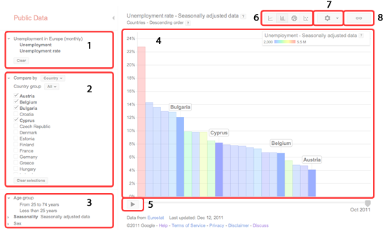
Image Key
- Data pane
- "Compare by" pane
- Filters pane
- Chart area
- Play button
- Chart type selector
- Chart settings
- Link button
Creating Charts
To create a chart:
(1) Select a chart type using the chart type selector. There are four chart types to choose from:
- Lines
- Bars
- Map
- Bubbles
(2) Select statistics to show in your chart by clicking on the metric names in the data pane. If the current visualization is a line chart, then the chosen metric will automatically be applied to the y-axis. Otherwise, a drop-down menu will appear listing the chart features (e.g., y-axis, color, size) that this metric can be applied to. Note that a single metric can be applied to multiple features, if desired.
(3) Choose entities to compare by clicking on the checkboxes in the "Compare by" pane. In many datasets, you can also click on the current comparison category (e.g., "Countries") to compare by another dataset dimension.
(4) Pick values to filter on by selecting entities in the filter pane. Like the statistics chosen earlier, filter values are associated with chart features via a drop-down menu. Note that, in some datasets, there is nothing to filter on so this pane does not appear in the UI.
(5) Click on the play button (in a bar, map, or bubble chart) to animate the bars or bubbles in the chart over time; alternatively, in a line chart, adjust the x-axis time range by sliding the tabs in the timeline below the chart.
(6) Enjoy your visualization!
Extra Features
Move bar or bubble labels by clicking and dragging them in the chart area.
Get data at a particular time point by hovering over a line, bar, or bubble in the chart area. In the case of a line chart, a pop-up will appear containing the metric value. For the other chart types, labels will appear on the axes and/or legend containing the values for the chosen bar or bubble.
Select or deselect entities by clicking on individual bars and bubbles in the chart.
Fine-tune your visualization using the options in the chart settings menu. These allow you to switch to a logarithmic scale, hide unselected bars or bubbles, or show bubble trails, among other things.
Save a chart or embed it in your website by clicking on the link button. See this article for more details.