Adding Google Maps to your reports gives your viewers a familiar interactive environment where they can explore geographic data. Google Maps in Looker Studio are highly customizable and integrate with any data source that contains valid geo fields.
In this article:See your data plotted on Google Maps
- Edit your report.
- Navigate to the page that will contain the chart.
- In the toolbar, click
Add a chart.
- Select one of the preset Google Maps:
- Bubble maps show your data as colored circles.
- Filled maps show your data as shaded areas.
- Heatmaps show your data using a color gradient.
- Line maps show your data as lines or paths over a geographic area.
- Connection maps shows your data as pairs of points that are connected by a line or an arc.
- Combo maps show your data as a combination of a filled map and a bubble map.
- Click the canvas to add the chart to the report.
- Use the properties panel on the right to add or change the Location or Geospatial field so your map displays the desired locations.
- Refer to the following sections for information on configuring the rest of your map.
What you need to use Google Maps in Looker Studio
To add Google Maps to Looker Studio, you'll need a data source with one or more geographic dimensions. Data sources that are based on Google Analytics and Google Ads automatically include fields that you can use, such as Country, City, Region, Metro area, Store location, and so on.
For other data source types, such as Google Sheets or BigQuery, make sure that any geographic fields have the right data type:
- Edit the data source.
- Locate the geographic dimension(s) that you want to use in Google Maps.
- Use the Type menu to select the appropriate Geo field type (Country, City, Region, for example).
Learn more about geographic dimensions.
Configure Google Maps
Configure a bubble map
Example
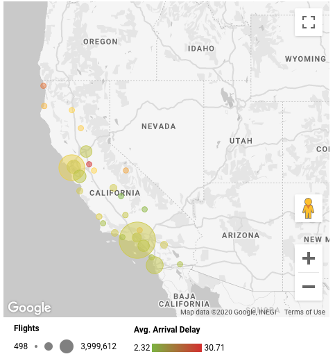
Here's a bubble map that shows airline arrivals in California. The number of flights is represented by bubble size. Average arrival delay is represented by bubble color.
Data properties
Location
A dimension that determines where the data appears on the map. Note that this field can be of any data type, as long as Google Maps can geocode the values appropriately.
Tooltip
(Optional) A dimension that provides tooltips (labels) for the data. Providing a tooltip lets you override the default label that is provided by the location dimension. For example, you can base the map location on a store’s address but use the store’s name in the tooltip.
The Tooltip option requires unique values for each location value. If the Tooltip values are duplicated, you'll see an error message:
Can't show Google Maps
The Tooltip dimension has multiple values for the same location. Choose a Tooltip dimension that has a unique value for each location.
To fix this, use a dimension that has a 1:1 relationship with your location dimension.
Color dimension
(Optional) A dimension that provides the categories that are used for the color of the geo data. If you choose this option, you can't use the color metric option.
The Color dimension option requires unique values for each location value. If the Color dimension values are duplicated, you'll see an error message:
Can't show Google Maps
The Color dimension has multiple values for the same location. Choose a Color dimension that has a unique value for each location.
To fix this, use a dimension that has a 1:1 relationship with your location dimension.
For example, the following map uses Country as the location dimension, but uses Sub Continent to provide the bubble colors. Each country is shown using a color representing the sub-continent in which it's found.

Color metric
(Optional) A metric that provides the values that are used as a color scale for the geo data. If you choose this option, you can't use the color dimension option.
Size
Use the size of the bubbles to convey relative metric values.
Style properties
Bubble Layer
|
Max number of bubbles |
Sets the maximum number of bubbles appearing on the map. |
| Slider control |
Sets the relative size of the bubbles. |
|
Opacity |
Sets the opacity of the bubbles. |
|
Border weight |
Sets the thickness of the bubble borders. |
Configure a filled area map
Example
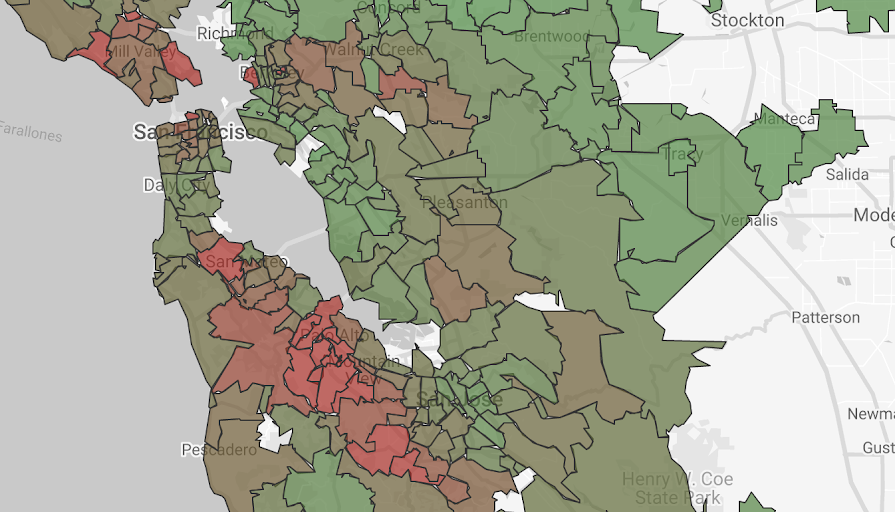
Here's a filled area map that shows median house prices by U.S. ZIP codes in the San Francisco Bay Area.
Data properties
Location
A dimension that determines where the data appears on the map. Note that this field can be of any data type, as long as Google Maps can geocode the values appropriately.
Geospatial field
A dimension that defines the polygons that are displayed on a filled map. This option is only available when you connect to a BigQuery data source that contains GEOGRAPHY data. When you use a Geospatial field, the Location field merely provides information for the card that appears when you hover over a data point on the map.
Tooltip
(Optional) A dimension that provides tooltips (labels) for the data. Providing a tooltip lets you override the default label that is provided by the location dimension. For example, you can base the map location on a store’s address but use the store’s name in the tooltip.
The Tooltip option requires unique values for each location value. If the Tooltip values are duplicated, you'll see an error message:
Can't show Google Maps
The Tooltip dimension has multiple values for the same location. Choose a Tooltip dimension that has a unique value for each location.
To fix this, use a dimension that has a 1:1 relationship with your location dimension.
Color dimension
(Optional) A dimension that provides the categories that are used for the color of the geo data. If you choose this option, you can't use the color metric option.
The Color dimension option requires unique values for each location value. If the Color dimension values are duplicated, you'll see an error message:
Can't show Google Maps
The Color dimension has multiple values for the same location. Choose a Color dimension that has a unique value for each location.
To fix this, use a dimension that has a 1:1 relationship with your location dimension.
Color metric
(Optional) A metric that provides the values that are used as a color scale for the geo data. If you choose this option, you can't use the color dimension option.
Style properties
Filled Area Layer
| Max. number of polygon vertices | Sets the maximum number of data points that can be plotted. Only available for BigQuery data sources. |
|
Opacity |
Sets the opacity of the filled areas. |
|
Border color |
Sets the color of the filled area borders. |
|
Border weight |
Sets the thickness of the filled area borders. |
Configure a heatmap
Example
Here's a heatmap that shows bike share statistics for London, U.K.

Data properties
Location
A dimension that determines where the data appears on the map. Note that this field can be of any data type, as long as Google Maps can geocode the values appropriately.
Weight (optional)
A metric that determines how much each individual point contributes to the appearance of your heatmap. By default, every point has the same value. You can specify a field with weights if you want to assign different values to the points.
Style properties
Heatmap layer
A heatmap aggregates points to create the visualization. To create the map, a circle is drawn around each point, and values in the circle decrease as the distance from the point increases. These settings control the appearance of the circles.
|
Heatmap aggregation |
When multiple circles overlap, their values are aggregated in one of two ways:
|
| Slider control |
Sets the relative size of the circles. |
|
Opacity |
Sets the opacity of the circles. |
|
Color domain min/max |
Sets minimum and maximum values for the color range. |
|
Intensity |
Adjusts the range of colors in the heatmap towards the high or low end. |
Tip: Heatmaps in Looker Studio are based on the deck.gl visualization library. You can learn more about these settings in the heatmap layer documentation.
Configure a line map
Example
Here's a line map that shows roads in the state of New York. The map is filtered by route_type to include only "I" (interstate) roads.

This example was created using the BigQuery US Roads public dataset.
Data properties
Location
A dimension that determines where the data appears on the map. Note that this field can be of any data type, as long as Google Maps can geocode the values appropriately.
Geospatial field
A dimension that contains BigQuery linestring data. This option is only available when you connect to a BigQuery data source that contains GEOGRAPHY data. When you use a Geospatial field, the Location field just provides the default tooltip, unless you override it with a different Tooltip dimension.
Tooltip
(Optional) A dimension that provides tooltips (labels) for the data. Providing a tooltip lets you override the default label that is provided by the location dimension. For example, you can base the map location on a store’s address but use the store’s name in the tooltip.
The Tooltip option requires unique values for each location value. If the Tooltip values are duplicated, you'll see an error message:
Can't show Google Maps
The Tooltip dimension has multiple values for the same location. Choose a Tooltip dimension that has a unique value for each location.
To fix this, use a dimension that has a 1:1 relationship with your location dimension.
Color dimension
(Optional) A dimension that provides the categories that are used for the color of the geo data. If you choose this option, you can't use the color metric option.
The Color dimension option requires unique values for each location value. If the Color dimension values are duplicated, you'll see an error message:
Can't show Google Maps
The Color dimension has multiple values for the same location. Choose a Color dimension that has a unique value for each location.
To fix this, use a dimension that has a 1:1 relationship with your location dimension.
Thickness metric
(Optional) A metric that determines the relative thickness of the lines on the map. You can adjust the thickness of the lines by using the Style > Line map layer > Thickness slider.
Color metric
(Optional) A metric that provides the values that are used as a color scale for the geo data. If you choose this option, you can't use the color dimension option.
Style properties
Line map Layer
| Max. number of line vertices | Sets the maximum number of data points that can be plotted. Only available for BigQuery data sources. |
|
Opacity |
Sets the opacity of the lines. |
|
Thickness slider |
Sets the thickness of the lines. |
Configure a connection map
The connection map lets you visualize your location data as sequences of points that are connected by a line.
This visualization also supports vector graphics and three-dimensional viewing. When the Show in 3D view style setting is enabled and the map is tilted, the line that connects your data points is displayed as an arc. When the Show in 3D view style setting is disabled and the map is tilted, or if the map is not tilted, the line that connects your data points is displayed as a line. Visualizing your data connections in three dimensions may be particularly useful if your data point connections appear to overlap when viewed in two dimensions.
Example
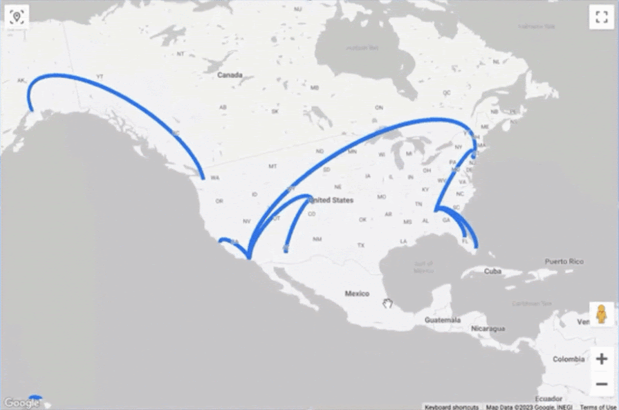
Here's a connection map that depicts flights between US cities. Note how the two-dimensional visualization seems to hide the overlapping connections between cities in Georgia and Florida in the southeast. Tilting the map reveals both connections.
Data properties
Location fields
These dimensions determine the locations and connection sequence for the data points that appear on the map. These fields can be of any data type, as long as Google Maps can geocode the values appropriately. Each dimension's data type should be identical, with the exception that you can connect location values such as City or Country to latitude-longitude coordinates. For example, you can connect City to to latitude-longitude or Country to latitude-longitude, but you cannot connect City to Country. If the location types are incompatible, you'll see an error message:
To add a data point, enter a dimension for Point 1. To connect additional points, click Add dimension and select another dimension. When only Point 1 is specified, the map connects all the values for that dimension. You can connect up to 10 dimensions. The connection map will graph the line between each point sequentially.
For example, say that your US flight data contained data points for stops that were made before the flight arrived at its final destination. Point 1 is the origin city, Point 2 is a layover city, and Point 3 is the destination city. The connection map will connect Point 1 to Point 2 and Point 2 to Point 3 to create one continuous line.
Tooltip
(Optional) A dimension that provides tooltips (labels) for the data. Providing a tooltip lets you override the default label that is provided by the location dimension. For example, you can base the map location on a store’s address but use the store’s name in the tooltip.
The Tooltip option requires unique values for each location value. If the Tooltip values are duplicated, you'll see an error message:
Can't show Google Maps
The Tooltip dimension has multiple values for the same location. Choose a Tooltip dimension that has a unique value for each location.
To fix this, use a dimension that has a 1:1 relationship with your location dimension.
Color dimension
(Optional) A dimension that provides the categories that are used for the color of the geo data. If you choose this option, you can't use the color metric option.
The Color dimension option requires unique values for each location value. If the Color dimension values are duplicated, you'll see an error message:
Can't show Google Maps
The Color dimension has multiple values for the same location. Choose a Color dimension that has a unique value for each location.
To fix this, use a dimension that has a 1:1 relationship with your location dimension.
Thickness
(Optional) A metric that determines the relative thickness of the lines on the map. You can adjust the thickness of the lines by using the Style > Connection map Layer thickness slider.
Color metric
(Optional) A metric that provides the values that are used as a color scale for the geo data. If you choose this option, you can't use the color dimension option.
Style properties
Connection map Layer
|
Thickness slider |
Sets the thickness of the lines. |
| Path accuracy (geodesic) |
Geodesic paths represent the shortest distance between two points on a sphere. This setting helps to visualize three-dimensional relationships on a two-dimensional surface. When this setting is enabled, when viewing the map in two dimensions, the connection between two points appears as a curved line. When this setting is disabled, when viewing the map in two dimensions, the connection between two points is displayed as a straight line. |
Configure a combo map
The combo map enables you to combine the properties of a filled map and a bubble map. When you define the filled map with a dimension and the bubble map with a metric, the two map types are layered on a single chart.
Example
Here’s a combo map that shows countries with their median age depicted as an overlying bubble layer. Median age is represented by bubble size, with larger bubbles corresponding to higher ages.
The Show in 3D view style property is available in the Background Layer style property for combo maps. When this property is enabled, you can tilt the map perspective manually to emphasize the relative size difference of the bubble heights. Here’s an example of the same map with the Show in 3D view style property enabled:

Data properties
Location
A dimension that determines where the data appears on the map. Note that this field can be of any data type, as long as Google Maps can geocode the values appropriately.
Additional Layer Metric
A metric that determines the overlying layer on the map.
When the Show in 3D view style property is disabled, this layer appears similar to a standard bubble map, with bubble diameter indicating the metric’s scale. When the Show in 3D view style property is enabled, this layer appears as columns with equal diameters and heights indicating the metric’s scale.
Tooltip
(Optional) A dimension that provides tooltips (labels) for the data. Providing a tooltip lets you override the default label that is provided by the location dimension. For example, you can base the map location on a store’s address but use the store’s name in the tooltip.
The Tooltip option requires unique values for each location value. If the Tooltip values are duplicated, you'll see an error message:
Can't show Google Maps
The Tooltip dimension has multiple values for the same location. Choose a Tooltip dimension that has a unique value for each location.
To fix this, use a dimension that has a 1:1 relationship with your location dimension.
Color dimension
(Optional) A dimension that provides the categories that are used for the color of the geographic data. If you choose this option, the Color metric option is not available, and you cannot specify a color for the Additional Layer style property.
The Color dimension option requires unique values for each location value. If the Color dimension values are duplicated, you'll see an error message:
Can't show Google Maps
The Color dimension has multiple values for the same location. Choose a Color dimension that has a unique value for each location.
To fix this, use a dimension that has a 1:1 relationship with your location dimension.
Color metric
(Optional) A metric that provides the values that are used as a color scale for the geographic data.
Style properties
Additional Layer
Sets the appearance of the Additional Layer metric.
| Cylinder slider control | Sets the relative bubble heights, which are apparent when the map is tilted, when the Show in 3D view style property is enabled. |
| Circle slider control | Sets the relative size of the bubbles. |
|
Opacity |
Sets the opacity of the bubbles. |
| Additional layer color |
Sets the color of the bubbles. This setting is not available if you have defined a Color dimension setup property. |
Filled Area Layer
Sets the appearance of the Location dimension.
|
Opacity |
Sets the opacity of the filled areas. |
| Border color | Sets the color of the filled area borders. |
|
Border weight |
Sets the thickness of the filled area borders. |
Common style properties
All Google Maps types share these settings.
Title
If you select the Show title checkbox, you can add a title and customize its appearance and placement on the chart.
Title options
| Title | Provides a text field where report editors can enter a custom title for the chart. |
|
Title font type |
Sets the font type for the title text. |
| Title font size | Sets the font size for the title text. |
| Font styling options | Applies bold, italic, or underline styling to the title text. |
| Title font color | Sets the font color for the title text. |
| Left | Aligns the chart title to the left side of the chart. |
| Center |
Centers the chart title above or below the chart. |
| Right | Aligns the chart title to the right side of the chart. |
| Top | Positions the chart title at the top of the chart. |
| Bottom | Positions the chart title at the bottom of the chart. |
Background Layer
Controls the appearance of the base map.
|
Use vector graphics |
Enables tilt and optimized graphics. Use vector graphics is enabled by default for combo maps and connection maps. |
|
Show in 3D view |
Enables the map to be dragged and tilted in three dimensions. Show in 3D view is available for combo maps and connection maps only and is enabled by default. |
|
Type |
Sets the default map background: Map, Satellite with labels, Satellite. The Satellite with labels type is available only when the Use vector graphics setting is enabled. |
|
Style |
Sets the color theme for the map. Use the report's current theme, or select one of the preset map styles. Style is available only when the Map type is selected. You can also create a custom map style. |
|
Roads, Landmarks, Labels |
Use the sliders to select the level of background details to display in the map background. |
Layer Type
Determines how locations on the map are shown. You can show locations as:
- Bubbles
- Filled areas
- Line map
- Connection map
- Combo map
- Heatmap
Default viewport
Sets the default location of the map’s viewport, or inset.
To set a default viewport location, navigate to the desired location and zoom level on the map chart. Under Default viewport in the style properties, select Set as default view to save the placement of the map’s viewport.
When exploring the map, click the Reset viewport icon on the map chart to return to your default view.
If a map thumbnail and inset are displayed under Default viewport, that means a default viewport is already set for this map. To set a new default view, navigate the map to the new desired location and zoom setting, and click Set as default view.
The Default viewport option is best used when the Allow pan and zoom map control option is enabled.
Colors
Sets the bubble or filled area colors:
- If you have defined the Color dimension option in the setup properties, both the filled area and bubble layer map colors are managed in the Colors style property by selecting Manage dimension value colors.
- If you have defined the Color metric option in the setup properties, you can create a color scale by picking maximum, middle, minimum, and dataless color values.
Map Controls
Show or hide the interactive map view controls.
|
Allow tilt and rotation |
Enables the map to be dragged and tilted in three dimensions. Allow tilt and rotation is available when the Use vector graphics Background Layer style property is enabled. This control is not available for combo maps or connection maps. |
|
Allow pan and zoom |
Lets viewers adjust the map display with their mouse and keyboard. Users can still tilt the map when Allow pan and zoom is disabled if the Allow tilt and rotation setting is enabled (or if the Show in 3D view setting is enabled for combo maps or connection maps). |
| Show zoom control | Shows the plus sign |
| Show Street View control | Lets users display Street View images for supported locations. |
| Show fullscreen control | Lets users display the map in fullscreen view. |
| Show map type control | Lets users switch between map view and satellite view. |
| Show scale control | Lets users display the map scale in kilometers or miles. |
Size Legend, Color Legend, and Weight Legend
Legends help your viewers understand the map by describing the colors and bubble sizes used.
Size legends describe the Size metric in bubble maps and the Thickness metric in connection maps. Color legends describe the Color dimension or Color metric. Weight legends describe the Weight metric. Thickness legends describe the Thickness metric that is used in a line map. Height legends describe the height of the Additional Layer Metric that is used in a combo map.
If your map specifies a Color dimension, the Color Legend uses distinct colors for each value. If your map specifies a Color metric, the Color Legend uses a color gradient.
Examples:
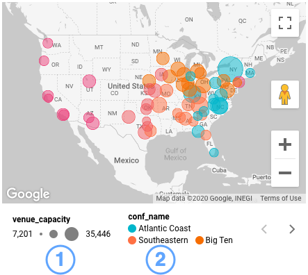
Sports venue capacity of NCAA team conferences.
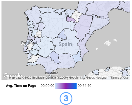
Average time on page by region.
- Size legend based on the venue capacity metric.
- Color legend based on the conference name dimension. View additional conference legends by clicking
.
- Color legend based on the Avg. Time on Page metric.
Background and border
These options control the appearance of the chart background container.
| Background | Sets the chart background color. |
| Border Radius | Adds rounded borders to the chart background. When the radius is 0, the background shape has 90° corners. A border radius of 100° produces a circular shape. |
| Opacity | Sets the chart opacity. 100% opacity completely hides objects behind the chart. 0% opacity makes the chart invisible. |
| Border Color | Sets the chart border color. |
| Border Weight | Sets the chart border line thickness. |
| Border Style | Sets the chart border line style. |
| Add border shadow | Adds a shadow to the chart's lower and right borders. |
Chart Header
The chart header lets viewers perform various actions on the chart such as exporting the data or sorting the chart. The following chart header options are available:
| Show on hover (default) | Three vertical dots appear when you mouse over the chart header. Click these dots to access the header options. |
| Always show | The header options always appear. |
| Do not show | The header options never appear. Note that report viewers can always access the options by right-clicking the chart. |
| Color | Sets the color of the chart header options. |
Create a custom Google Maps map style
A Google Maps map style lets you customize the visibility and appearance of some map features. You can create a custom Google Maps style in the following ways:
Import a map style using JSON
Create a JSON file for your map with the Google Maps Platform Styling Wizard:
- In the Style drop-down menu of the Style properties panel, select Edit JSON.
- Open the Google Maps Platform Styling Wizard and select the Use the legacy JSON styling wizard option from the notification pop-up.
- Customize the features and theme of your map style. Select Finish.
- To use this JSON styling, select Copy JSON from the Use JSON styling pop-up dialog.
- Return to the Import map style dialog in Looker Studio, and paste in the copied JSON in the code block.
- Select Import.
Your new map style will be applied to your map. It will appear in the Style drop-down menu as Custom.
Create and import a map ID
To create and import a map ID, you must first create a map style and a map ID in the Google Cloud console:
- In the Style drop-down menu of the Style properties panel, select Edit custom Map ID.
- In the Google Cloud console, create a new map style.
- Next create a map IP. Specify a JavaScript map with a vector map type. Copy the map ID.
- Associate the map ID with your new map style.
- Return to the Import map ID dialog in Looker Studio, and paste in the copied map ID in the Paste Map ID here field.
- Select Import.
Your new map style will be applied to your map. It will appear in the Style drop-down menu with the name that you assigned it in the Google Cloud console.
Tips and limits for working with BigQuery GEOGRAPHY data
Each Google Maps style in Looker Studio can plot up to 1 million points (polygon vertices).
If your query returns more data, the map will show as many polygons as it can within the limit, and you may notice missing polygons.
To reduce the number of points, follow these steps:
- Apply a filter.
- Filters on a
GEOGRAPHYfield can select up to 1 GB of data. If your filters return more, you’ll get an error.
- Filters on a
- Simplify the polygons in BigQuery using the ST_SIMPLIFY function.
Blended and extracted data sources don’t support GEOGRAPHY fields. To join a table containing your GEOGRAPHY field with another table, perform the join in BigQuery using SQL.
Geo functions
Looker Studio provides a number of geo functions that you use to work with and transform geographic information in your data sources.
To learn more about these functions, view the Looker Studio function list and filter the functions by Geo type.
Limits of Google Maps
- Filled area maps don't support Latitude, Longitude or Address geographic field types.
- For bubble maps, Postal Code can be a U.S. ZIP code (for example, 94043) or an international postal code (example: L4L 9H8). For filled area maps Postal Code can be a U.S. ZIP code.
- Connection maps require points that have compatible geographic field types.
- Maximum data limit:
- 1 million bubbles for Latitude, Longitude fields.
- 1 million points (polygon vertices) for Geospatial fields (BigQuery
GEOGRAPHY). - 3,500 bubbles or filled areas for other geographic field types.
Increasing a map's data limit can make it load more slowly.
- You can't enable drill down in Google Maps.
- Google Maps doesn't support using optional metrics.
- Location names longer than 500 characters will not be geocoded.