We recently (October 2019) made improvements to how fields in your data sources are defined and aggregated by default. These changes make it easier to model your data, and make calculated fields more robust.
You don't need to take any action. Charts and calculated fields used in your reports will work as before the upgrade.
What's changed?
We've made the following improvements:
Refined the definitions of "dimension" and "metric"
Dimension -- A set of unaggregated values by which you can group your data. As before, dimensions in your data source appear as green fields.
Metric -- A specific aggregation that you can apply to a set of values. Because a metric itself has no defined set of values, you can’t group by it. As before, metrics in your data source appear as blue fields.

Introduced default aggregation
We've changed the "Aggregation" column in a data source to "Default aggregation." This is the aggregation method that is used when you include that field in a chart in a Looker Studio report, unless you override it.
For data sources based on flexible schema data sets, such as Google Sheets, BigQuery, CSV file upload, etc., fields containing unaggregated numeric data appear as dimensions with a default aggregation of Sum. You can use these fields as either dimensions or a metrics in your charts. If used as a metric, the values are summed, however, you can still change the aggregation method in the chart itself.
Metrics in your data source always have a default aggregation of Auto, which can't be changed. This includes already-aggregated data from fixed schema data sources, such Google Analytics and Google Ads, as well as calculated fields you create that include a specific aggregation method.
Learn more about aggregation and data modeling.
Made calculated fields more robust
If you create calculated fields without specifying an aggregation function in the formula, the result is an unaggregated dimension. To create an aggregated metric, include the desired aggregation function. For example:
Profit / Revenue results in a numeric dimension. You can set the field's aggregation manually in the data source, or in charts that use this field.
vs.
SUM(Profit) / SUM(Revenue)results in a metric. The aggregation is Auto, and won't change even if the underlying fields' default aggregation changes.
Learn more about calculated fields.
Why do I see "deprecated" fields in my data source?
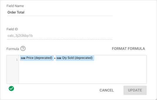
A small number of older data sources may contain fields marked as "deprecated." These are unaggregated numeric fields that have been copied and converted to dimensions with a default aggregation of Sum. The original fields still exist in the data source and still appear as before the upgrade in any charts or controls, but you won't be able to add them to new components.
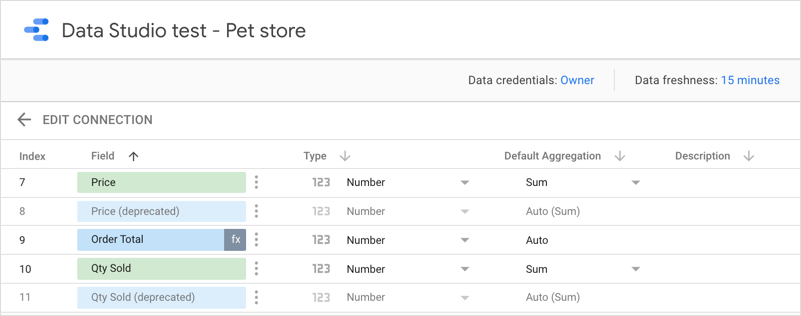
Example of an upgraded data source.
In the example above, the original Price and Qty Sold fields have been deprecated (rows 8 and 11). Their original aggregation of Sum has been set to Auto (Sum). New, upgraded versions of those fields have been added to the data source (rows 7 and 10). These appear as numeric dimensions (green) with default aggregations of Sum.
The Order Total calculated field (row 9) still references the deprecated fields and still works as before. New calculations based on Price or Qty Sold should use the new fields, not the deprecated versions.