In Looker Studio, a chart displays data from one or more fields. These fields are the dimensions and metrics provided by the data source attached to that chart. How the data appears depends on the type of chart and how you've styled it.
In this article:How data appears in your charts
In tables, the data appears in rows and columns, such as in this example based on a Google Analytics data source:
| Browser | Sessions | Avg. Session Duration | Bounce Rate |
|---|---|---|---|
| Chrome | 3,340 | 00:03:35 | 22.90% |
| Safari | 209 | 00:02:33 | 15.79% |
| Firefox | 202 | 00:02:20 | 19.80% |
| Internet Explorer | 64 | 00:02:21 | 17.19% |
| Edge | 37 | 00:05:37 | 16.22% |
| ... |
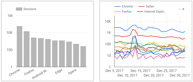
In Cartesian charts, dimensions are typically laid out along the horizontal (X) axis, while metrics values provide the vertical (Y) axis positioning. In a time series, the date range dimension provides the X axis and a breakdown dimension provides the data series.
In a pie chart, a dimension defines the number of segments, while a metric determines the size of each segment.

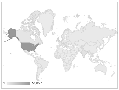
Geo charts use a dimension that contains geographic information (such as a country code, latitude and longitude, or Google Ads Criteria ID) to display your data on a map. The relative values of the metric determine the intensity of color on the chart, as show in this example showing that the majority of website sessions occurred in the United States:
Learn more about the charts you can use in Looker Studio.
Use breakdown dimensions to group data
Many charts allow you to group your data by multiple dimensions. Each dimension you add to the chart groups the data into ever finer levels of detail. The first dimension in the chart is the primary; additional dimensions are called breakdown dimensions (because they allow you to breakdown or sub-categorize your data into smaller chunks).
For example, in the following table, the primary dimension is Country, and the breakdown dimension is Year. The metrics in the table are aggregated first by country, then by year. (See below for more on how grouping affects metric calculation).
| Country | Year | Population | Internet Users | Internet % |
|---|---|---|---|---|
| Iceland | 2013 | 323,764 | 312,583 | 96.55% |
| Iceland | 2012 | 320,716 | 308,560 | 96.21% |
| Bermuda | 2013 | 65,001 | 61,945 | 95.30% |
| Norway | 2013 | 5,079,623 | 4,828,354 | 95.05% |
| Iceland | 2011 | 319,014 | 302,488 |
94.82% |
| ... |
Making sense of multi-dimensional data in a table can be challenging. Using other visualization types, such as this stacked bar chart, can help make sense of complex data. For example, a stacked column chart can be used to display a comparison of internet users in China, the United States, Japan, India, Brazil, Germany, Russia, the United Kingdom, France, and the Republic of Korea by year.

How metrics are calculated
In Looker Studio, metrics are calculated in two basic ways:
As overview totals
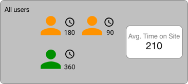
Metrics can be displayed as a summary statistic for the entire column (field) in your data set using the Scorecard chart.
The example below shows simplified data from Google Analytics. Here, the Avg. Time on Site metric is summarized for all users, regardless of any other consideration, such as whether they are new or returning visitors. The calculations for time on site are computed using the time difference between each user's initial session and the exit, with the sum of each session length averaged across three sessions.
In association with one or more dimensions
Metric values can be qualified by selected dimension(s). All the other chart types fall into this category.
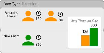
In the following example, the bar chart pairs the Avg. Time On Site metric with the User Type dimension. This visualization lets you analyze this metric via returning vs new users, where the calculations are modified by the requested dimension.
Adding multiple dimensions to a chart refines your view of the data. For example, suppose you use both the User Type dimension and the Language dimension in a table to analyze time on site for your website. In this case, the calculation for new versus returning users is the same, but that calculation is aggregated per language. Your table might look like this:
| User Type | Language | Avg. Session Duration |
|---|---|---|
| Returning Visitor | zh-tw | 00:04:54 |
| New Visitor | zh-tw | 00:04:02 |
| Returning Visitor | en-us | 00:03:51 |
| New Visitor | en-us | 00:03:45 |
| Returning Visitor | en-gb | 00:03:33 |
| ... |