Pie charts display your data in a circular visualization, with sections (slices of the pie) representing your data series. The sizes of the slices are proportional to the quantity or relative value of the metric you are plotting. In general, pie charts are most useful when comparing a few data points with relatively large differences in proportion between the values. Pie charts that display large numbers of series with minor variations in the data can be confusing to viewers of the chart.
In this article:Pie charts in Looker Studio
Pie charts in Looker Studio visualize the relative values for a single dimension/metric combination. The dimension determines the number and names of the slices, while the metric determines the proportion of each slice. Pie charts in Looker Studio support as few as one slice to as many as 10 slices. Looker Studio automatically aggregates any superfluous data points into a slice labeled Others. The pie can be solid, or it can be donut (ring) shaped.
Pie chart examples
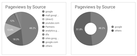
The following pie charts visualize the same data: the percentage of the Pageviews metric by Source dimension. Each colored pie slice represents a traffic source, identified in the legend at the right of the chart. The slice colors are assigned according to the metric value: highest is blue, 2nd highest is red, and so on. (You can change these colors in the Style tab in the Properties panel.) The percentage of Pageviews for each traffic Source appears as text labels on the larger slices. (You can see the percentages for the smaller slices by hovering your cursor over them.)
The first chart is configured to show 10 slices. The second chart shows just two slices, and is also using the donut style option. In the first chart, Looker Studio uses the 10th slice to aggregate any remaining traffic sources into the Others category. The second chart compares the largest traffic source ("google" in this case) to all the other sources combined.
Configure the chart
Add a new chart or select an existing chart. Then, on the right, use the Properties panel to configure the chart's Setup and Style tab properties.
The options in the Setup tab of the Properties panel determine how the chart's data is organized and displayed.
Data source
A data source provides the connection between the component and the underlying dataset.
- To change the chart's data source, click the current data source name.
- To view or edit the data source, click
. (You must have at least Viewer permission to see this icon.)
- Click +BLEND DATA to see data from multiple data sources in the same chart. Learn more about data blending.
 . (You must have at least
 Date range dimension
This option appears if your data source has a valid date dimension.
Note: This option does not appear for Google Ads or Google Analytics data sources, as these automatically select a dimension of type Date from the data source.
The Date range dimension is used as the basis for limiting the date range of the chart. For example, this is the dimension that is used if you set a date range property for the chart or if a viewer of the report uses a date range control to limit the time frame.
Dimension
Dimensions are data categories. Dimension values (the data that is contained by the dimension) are names, descriptions, or other characteristics of a category.
Pie charts can have one dimension.
Drill down
This option appears on charts that support it.
Drilling down gives viewers a way to reveal additional levels of detail within a chart. When you turn on the Drill down option, each dimension that you add becomes another level of detail that you can drill into. Learn more about chart drill down.
Metric
Metrics measure the things that are contained in dimensions and provide the numeric scale and data series for the chart.
Metrics are aggregations that come from the underlying data set or that are the result of implicitly or explicitly applying an aggregation function, such as COUNT(), SUM(), or AVG(). The metric itself has no defined set of values, so you can’t group by a metric as you can with a dimension.
Pie charts can have one metric.
Optional metrics
You can add optional metrics by selecting the Optional metrics switch and selecting metrics from the Add metric field selector. You can also drag and drop metrics from the fields list on the Data panel to the Optional metrics selector.
Set the default sort
The Sort option in the chart's setup panel control the default sorting behavior. You can select any metric in the chart's data source, or any dimension that is currently displayed in the chart, to use as the primary sorting field.
Default date range
The Default date range property lets you set a timeframe for an individual chart.
Default date range options
| Auto | Uses the default date range, which is determined by the chart's data source. |
| Custom | Lets you use the calendar widget to select a custom date range for the chart. |
| Date compare type | Displays comparison data for the selected time period. |
Learn more about working with dates and time.
Google Analytics segment
This option appears for charts based on a Universal Analytics data source.
A segment is a subset of your Analytics data. You can apply segments to your Looker Studio charts to help ensure that your Looker Studio and Google Analytics reports show the same data. Learn more about Analytics segments in Looker Studio.
Filter
Filters restrict the data that is displayed in the component by including or excluding the values that you specify. Learn more about the filter property.
Filter options
| Filter name | Click an existing filter to edit it. Mouse over the filter name and click X to delete it. |
| +Add a filter | Click this option to create a new filter for the chart. |
Chart interactions
When the Cross-filtering option is enabled on a chart, that chart acts like a filter control. You can filter the report by clicking or brushing your mouse across the chart. Learn more about cross-filtering.
The options in the Style tab control the overall presentation and appearance of the chart.
Title
If you select the Show title checkbox, you can add a title and customize its appearance and placement on the chart.
Title options
| Title | Provides a text field where report editors can enter a custom title for the chart. |
|
Title font type |
Sets the font type for the title text. |
| Title font size | Sets the font size for the title text. |
| Font styling options | Applies bold, italic, or underline styling to the title text. |
| Title font color | Sets the font color for the title text. |
| Left | Aligns the chart title to the left side of the chart. |
| Center |
Centers the chart title above or below the chart. |
| Right | Aligns the chart title to the right side of the chart. |
| Top | Positions the chart title at the top of the chart. |
| Bottom | Positions the chart title at the bottom of the chart. |
Pie Chart
This section controls the overall appearance and layout of your chart.
Slices
Determines the number of slices to display. If your selected dimension contains more values than the number of slices, additional values will be aggregated into an Others category by default.
Group Others
Select the Group Others checkbox to aggregate the results that are outside of the specified Slices limit into one slice that will have the label Others. This checkbox lets you compare the individual branches against the context of the remaining results.
Group Others is enabled by default.
Color by
| Single color | When checked, the pie slices are displayed in shades of the same color. Otherwise, the chart displays in a veritable rainbow of happy colors (depending on your report theme).
You can change the series colors using the color pickers. |
| Slice order |
Use the current theme to color the data according to its position in the chart. This option emphasizes the ranking of the data over the identity of the data. You can set specific colors by using each data series' color picker. |
| Dimension values |
This option colors each dimension value in the chart with the color that is specified in the dimension value color map. This option ensures that your data uses color consistently, regardless of the position of that data in the chart. Learn more about coloring your data. |
Donut slider
Changes a solid pie to a donut. Slide the control to increase or decrease the diameter of the donut hole.
Label
These options control the appearance of the data labels.
| Slice font color | Sets the color of the data labels inside the pie slices. |
| Slice font size | Sets the size of the data labels inside the pie slices. |
| Slice font family | Sets the font family of the data labels inside the pie slices. |
| Slice label | Determines the style of the slice labels. Options are:
|
| Text contrast | Sets the font color automatically to provide better readability of your data labels. Choose from 3 levels of contrast, low, medium, or high. |
Legend
These options determine the placement of the chart legend.
| Legend font color | Sets the color of the legend labels. |
| Legend font size | Sets the size of the legend labels. |
| Legend font family | Sets the font family of the legend labels. |
| Legend placement options: | None - No legend appears. |
| Right - Legend appears on the right. | |
| Bottom - Legend appears on the bottom. | |
| Top - Legend appears on the top. | |
| Alignment - Sets the alignment of the legend relative to the selected position. | |
| Max lines -
Sets the number of lines used by the legend. If the number of series requires more lines, overflow items can be displayed by clicking the < and > arrows. Note that this setting only applies when the legend is set to Top. This setting has no effect if the legend is set to Right or Bottom. |
Background and border
These options control the appearance of the chart background container.
| Background | Sets the chart background color. |
| Border Radius | Adds rounded borders to the chart background. When the radius is 0, the background shape has 90° corners. A border radius of 100° produces a circular shape. |
| Opacity | Sets the chart opacity. 100% opacity completely hides objects behind the chart. 0% opacity makes the chart invisible. |
| Border Color | Sets the chart border color. |
| Border Weight | Sets the chart border line thickness. |
| Border Style | Sets the chart border line style. |
| Add border shadow | Adds a shadow to the chart's lower and right borders. |
Chart header
The chart header lets viewers perform various actions on the chart, such as exporting the data, drilling up or down, or sorting the chart. Chart header options are as follows:
| Show on hover (default) | Three vertical dots appear when you mouse over the chart header. Click these to access the header options. |
| Always show | The header options always appear. |
| Do not show | The header options never appear. Note that report viewers can always access the options by right-clicking the chart. |
| Color | Sets the color of the chart header options. |