Curious about whether your ad is clicked more often on Fridays than Sundays? Want to easily compare ad group impressions by quarter? Google Ads provides several ways to compare performance over time. This article will show you how to compare performance across two date ranges. You’ll also learn how to use segments to drill down to specific data sets.
Budgets (Account Optimization)
See more videos on how to improve your account performance.
Compare data from two time periods
Let's say that you want to know how your campaigns did last week compared with the week before. Or maybe you want to see data for the current month compared with this month last year. You can see all this by using the 'Compare' option in the date range selector.
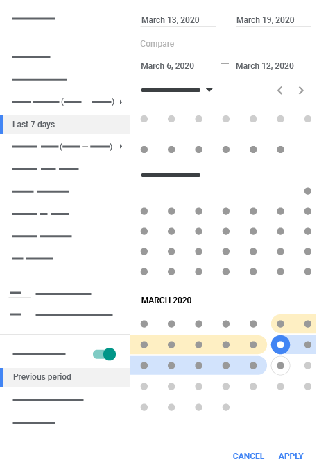
Instructions

- Click the down arrow next to the date range in the top right-hand corner of your screen.
- Click the toggle next to 'Compare' from the drop-down.
- Choose whether you’d like to compare the Previous period (default), the Previous year or a Custom date range.
- If you select Custom, you can select the dates that you’d like to measure above the calendar.
- Click Apply. You’ll see results for both date ranges in your performance chart.
You’ll now see the percent change in performance on the data tables of your campaigns, ad groups and ads & extensions page(s). To see the complete comparison metrics, you’ll need to click on the double arrows (< >) that have now appeared in each of your column headers. Doing so will expand a column to show four columns: the current date range, the previous date range, the numerical change between the two date ranges and the percentage change.
Once you choose a date range, both alone and as part of a comparison, those dates apply across your account (until you change them).
View explanations for the changes
When you turn on 'Compare', you’ll be able to see the explanations behind some of the changes in your performance. Click on the change percent or View explanations to open up the 'Explanations' panel where you can find information on what might have caused this change.
To see explanations, make sure that the two time periods that you selected are within the past 90 days, of equal length and are contiguous. Learn more about explanations.
Segment your data by time
Segments can provide a more granular view of your data. For example, say that you used the date range selector to look at overall performance for the last week, then decided you wanted to see that week broken down by day.
- Click the segment icon
above your statistics table
-
Select Time from the drop-down menu. A sub-menu will appear containing the following options:
- Day of the week (e.g. Monday, Tuesday, Wednesday)
- Day (e.g. Wed. 21 December 2011)
- Week
- Month
- Quarter
- Year
- Hour of the day
This will result in a split of your statistics table into rows based on the date range that you've selected. For example, when you create a 'Day of the week' segment, your single row of data will become eight rows of data: the original row plus one new row for every day of the week.
