May 11, 2024
How do I graphically summarize/aggregate quantities for categories of things?
Hi,
Thanks in advance for your help/guidance!
Context:
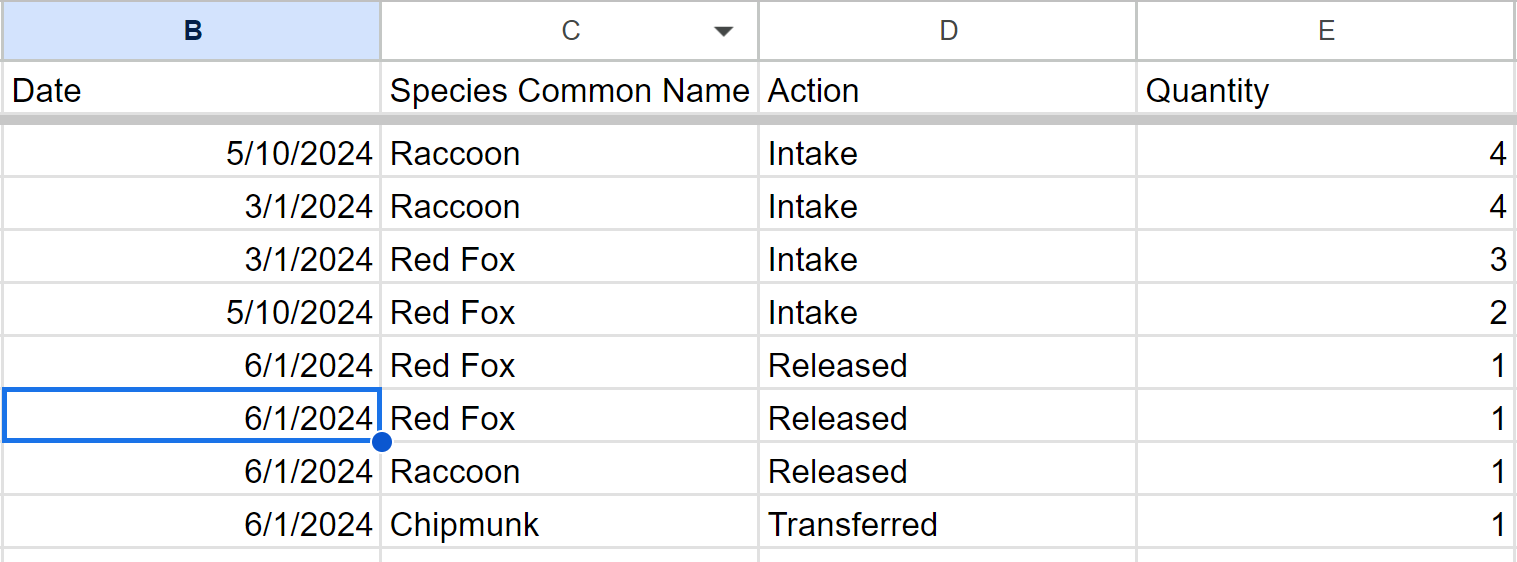
I volunteer at a Wildlife Rehab center where we use a simple Google Form to collect information such as:
- Animal type such as raccoon, fox, rabbit, etc. (pull down field)
- Quantity (short answer field) and
- Type of action such as new intake/patient, patient released, patient transferred, etc.
What's Working:
The graphs in Google Forms summary tab show separate graphs for the number/percentage of each animal and another for the number of each action. We have the form linked to Google Spreadsheet so the form responses also go there. At the bottom of this post is a snippet of the columns with some sample data.
Help Needed:
While the current Google Forms summary info is good, we need to report on the above mentioned in "What's Working" PLUS (and most importantly), the number of each type of action taken on each type of animal.
It "feels" like I either need to modify the Forms' summary charts (no idea how) - or - we need something such as an Excel Pivot table in a separate tab or similar is needed but I'm completely new to Google Forms and Spreadsheet. We are completely open to changing/enhancing the Form and/or Spreadsheet... :-)
- Is there is a way to structure the Form so the Forms auto-created summary graphs show what we need - and if so, how would we do this? And/Or how do I modify the auto-created graphs in the summary tab?
- If this needs to be accomplished in the linked Google Spreadsheet, can you please provide steps on how we would do this?
Many thanks!
Scott
Details
Community content may not be verified or up-to-date. Learn more.
All Replies