Use a timeline chart to show important events in chronological order. For example, show a list of project tasks and their deadlines.
Learn how to add and edit a chart.
How to format your data
- First column: Enter the dates, or dates and times, that you want to show in the chart.
- Second column: Enter numerical data. You can also add a category name (optional).
- Third and fourth column (Optional): Enter a note about the title.
- Fourth column (Optional): Enter notes about each event.
- Rows: Each row represents a point on the chart.
Examples
Expenses

| Date | Expenses |
|---|---|
| 01/01/2018 | £300 |
| 01/02/2018 | £320 |
| 01/03/2018 | £200 |
| 01/04/2018 | £215 |
| 01/05/2018 | £245 |
| 01/06/2018 | £400 |
| 01/07/2018 | £390 |
| 01/08/2018 | £300 |

Student attendance
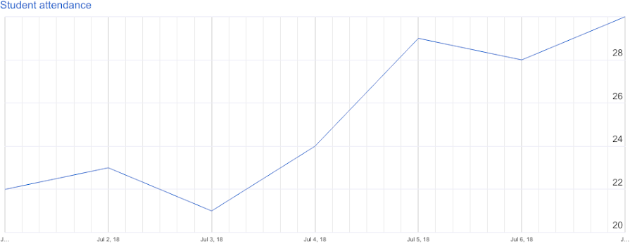
| Date | Student attendance |
|---|---|
| 01/07/2018 | 22 |
| 02/07/2018 | 23 |
| 03/07/2018 | 21 |
| 04/07/2018 | 24 |
| 05/07/2018 | 29 |
| 06/07/2018 | 28 |
| 07/07/2018 | 30 |

Customise a timeline chart
- On your computer, open a spreadsheet in Google Sheets.
- Double-click the chart that you want to change.
- At the right, click Customise
Timeline.
- Change how the chart looks, set min and max values, and more.