You can add metrics that compare each row of your data to the total value of a column. You can also apply running calculations to the data in your charts.
Add comparison metrics to a chart
- Edit your report.
- Select a chart.
- On the right, in the properties panel, select the SETUP tab.
- Choose a metric and click its edit pencil
.
- Click the Comparison calculation menu and select the desired comparison. See below.
- To display the metric's native value, change the Comparison calculation selection to None.
Compare to total
You can compare each row of data to the overall total for that field:
- Percent of total shows the current row's value divided by the total for that field.
- Difference from total shows the total for that field minus the current row's value.
- Percent difference from total shows the total for that field minus the current row's value divided by the total for that field.
Example
The table below shows the results of applying different "compare to total" options to the Order Value field.This lets you evaluate each order's contribution to overall sales.

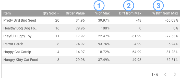
Compare to max
You can compare each row of data to the maximum value for that field:
- Percent of max shows the current row's value divided by the maximum value for that field.
- Difference from max shows the current row's value minus the maximum value for that field.
- Percent difference from max shows the current row's value minus the maximum value for that field divided by the total for that field.
Example
The table below shows the results of applying different "compare to max" options to the Order Value field. This lets you see how each order compares to the maximum order.
Relative comparison
When your chart includes a comparison date range, you can apply the comparison function to either the base data or to the corresponding comparison date range.
For example, the time series charts below compare the current 28 days to the previous 28 days. The first two charts show the original data. The maximum value of Sessions for the current period was 1,947 on June 26. The maximum value of Sessions for the previous period was 1,571 on June 4.
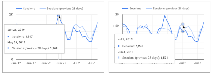
Original data.
The next chart applies the percent of max function, relative to base data. Every data point for the previous period is divided by the maximum value of the current period (1,947). For the data point on June 4, the percentage of max is 1571/1947 = 80.69%.
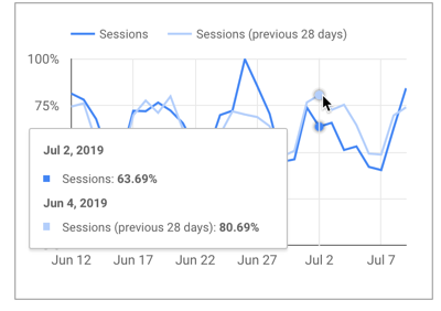
Percent of max, relative to base data.
The final chart applies the percent of max function, relative to corresponding data. Every data point for the previous period is divided by the maximum value of the previous period (1,571). For the data point on June 4, the percentage of max is 1571/1571 = 100%.
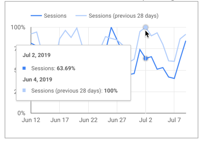
Percent of max, relative to corresponding data.
Apply running calculations
Running calculations compute summary results across a collection of values. Running calculations return a value for each row of input, expressing that row's relation to the collection as a whole.
The example below shows the application of 2 running calculations to the Analytics Users metric:
- Running sum
- Running delta
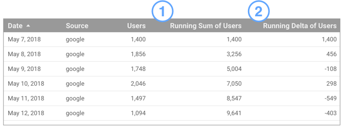
This allows you to see the cumulative number of users you have acquired up to a specific day, and how each day's numbers differ from each other.
Looker Studio supports the following running calculations:
- Running sum
- Running average
- Running min
- Running max
- Running count
- Running delta
- Running percentage delta
To apply a running calculation
- Edit your report.
- Select a chart.
- On the right, in the properties panel, select the SETUP tab.
- Add a metric to chart, and then click its edit pencil
- Click the Running calculation menu and select the desired function.
- To remove a running calculation, change the Running calculation option to None.
Differences between running calculations and calculated fields
Calculated fields work on the data in your charts on a row-by-row basis. Running calculations work across rows, making it easy to show complex data relationships, without having to code custom SQL queries in your data set. Such queries would be difficult, if not impossible to replicate in a calculated field in your data source.
However unlike calculated fields, you can't edit the formulas of running calculations.