2019 releases
- December 19, 2019
- November 26, 2019
- November 7, 2019
- October 31, 2019
- October 24, 2019
- October 17, 2019
- October 10, 2019
- October 3, 2019
- September 27, 2019
- September 12, 2019
- August 29, 2019
- August 22, 2019
- August 16, 2019
- August 8, 2019
- August 1, 2019
- July 18, 2019
- July 11, 2019
- June 27, 2019
- June 20, 2019
- June 6, 2019
- May 30, 2019
- May 23, 2019
- May 16, 2019
- May 2, 2019
- April 25, 2019
- April 18, 2019
- March 28, 2019
- March 21, 2019
- March 7, 2019
- February 7, 2019
- January 31, 2019
- January 24, 2019
- January 17, 2019
- January 9, 2019
See older releases
December 19, 2019
Product updates
Transfer ownership of reports and data sources
You can now make someone else the owner of your reports and data sources. First, share that asset with the intended owner, then change their permission to Is owner.
Create conditional formatting rules with AND and OR clauses
You can now create conditional formatting rules with multiple clauses using boolean logic. Learn more.
November 26, 2019
Product updates
Add links to image components
You can now add links to image components in your reports. Just add the link to the Image link URL field in the image properties.
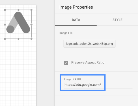
Learn more about adding images to your reports.
November 7, 2019
Product updates
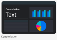
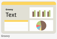
New themes add style and color your reports instantly
Themes let you instantly change the appearance of your reports. Themes make it easy to quickly create attractive and visually consistent reports. When you apply a theme, it updates the style settings for all the static and data elements in the report at once, saving you time and effort.
We've added a number of new themes to the Theme and Layout panel. The default theme uses high contrast, colorblind-safe colors. Other themes provide a wide variety of visual styles. You can customize any of the built-in themes to suit your individual tastes and needs.
Example themes:
 |
 |
 |
Learn more about themes.
See Data Studio reports with custom visualizations
You can now see examples of reports that showcase community visualizations (charts built by 3rd party developers) in the Data Studio Report Gallery.
October 31, 2019
Product updates
Improved data modeling in your data sources
We've improved how fields in your data sources are defined and aggregated by default. These changes make it easier to model your data, and make calculated fields more robust.
You don't need to take any action. Charts and calculated fields used in your reports will work as before the upgrade. Learn more.
Skip "Add to report" dialog
You can now permanently dismiss the "Add data source to report" dialog when creating a new report or adding data sources to an existing report.
October 24, 2019
Product updates
Add conditional formatting to tables and scorecards
You can now create conditional formatting rules to add color and style to your data when those conditions are met. Learn more about conditional formatting.
October 17, 2019
Product updates
Add images by URL
You can now add images hosted on the web to your reports by entering the link to the image. Learn more about adding text, images, lines, and shapes.
October 10, 2019
Product updates
Drive migration completed for consumers
As previously announced, Data Studio is moving off of Google Drive. This migration is now complete for non-G Suite users.
Pivot table interaction filters
You can now add chart interaction filters to pivot tables. When interactions are enabled on a chart, you can filter the report by clicking a data series in that chart. Learn more about chart interaction filters.
Simplified cache
There is now a single data cache, and no need to separately manage caches for different data source types. Learn more about how to manage data freshness.
October 3, 2019
Product updates
Automatically set contrasting text colors in heatmaps and pie charts
Data Studio can now automatically determine the best font colors to use for your data labels in pie charts, and in heatmaps in tables and pivot tables. This can improve the readability of your charts in cases where the font color and data background colors don't have enough contrast. For example, the pie charts below all have the same font color selected. Each chart shows one of the 4 text contrast options: 1) Contrast = None, 2) Contrast = Low, 3) Contrast = Medium, 4) Contrast = High.
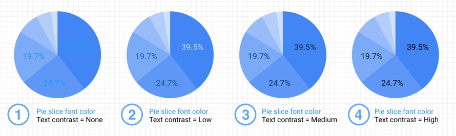
To set the contrast in a pie chart
- Select a pie chart.
- On the right, select STYLE.
- In the Label section, click the Text contrast drop-down menu and select the level of contrast you want.
For tables or pivot tables
- Select the chart.
- On the right, select STYLE.
- Turn on heatmap for one or more metrics in the table.
- For each heatmap metric, click the Heatmap text contrast drop-down menu and select the level of contrast you want.
- For tables, this option appears in the Table Body section.
- For pivot tables, this option appears in the Table Labels section.
September 27, 2019
Product updates
Google Ads Average position field sunset complete
Per the announcement on the Google Ads Help Center, we've completed the removal of the Average position metric from the Ads connector.
In addition, you can now access 2 new Auction Insights fields:
- Top of page rate
- Abs. top of page rate.
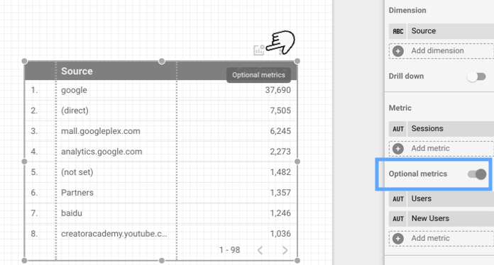
September 12, 2019
Product updates
Let viewers select the fields in charts
You can now make your charts and tables more flexible by adding optional metrics. This lets your viewers select which fields to display in the chart. Learn more.
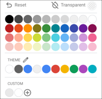
Easier access to theme colors
We've updated the color picker to include your theme colors, making it easier to create consistently styled reports.
Automatically create ratio metrics by blending scorecards
Blending 2 scorecards automatically creates a ratio metric, using the first chart you select as the denominator and the second chart as the numerator. For example, blending Costs and Clicks metrics automatically calculates your cost-per-click ratio. Learn more.
August 29, 2019
Product updates
Data Studio is migrating off of Google Drive
Since its initial release, Data Studio has used Google Drive to store and share reports, data sources, and explorations. To enable a number of product improvements, we will be migrating all Data Studio files off of Drive. You don't need to take any action but you can learn more here.
Expand and collapse rows in pivot tables
You can now show or hide different levels of information in the pivot table by clicking + and – in the column header. Viewers can then explore the data at the level of detail that interests them most. Expand-collapse also provides a way for a single pivot table to show both summary and detailed information, reducing the number of charts needed in your reports. Learn more.
See more data in pivot tables
You can now display more rows in pivot tables. The number of row dimensions available depends on the type of data you're connecting to:
- Fixed-schema data sources, such as Ads and Analytics, can have up to 5 row dimensions.
- Flexible-schema data sources, such as Google Sheets and BigQuery, can have up to 10 row dimensions.
Easily add featured community visualizations to your report
Featured community visualizations allow you to add charts built by 3rd party developers to your reports as easily as native charts built by Google. Learn more.
August 22, 2019
Product updates
Google Ads Average position field sunset
Beginning the week of September 30, 2019, we’re removing the average position metric from Google Ads. View the announcement on the Google Ads Help Center.
If your Data Studio reports include this metric, we recommend using Search top impression rate and Search absolute top impression rate metrics instead. These metrics reflect the actual placement of your ad on the page, rather than the position of your ad compared to others.
See minute-level data in charts
You can now visualize date and time data down to the minute with the new Date Hour Minute data type. Learn more about date data types.
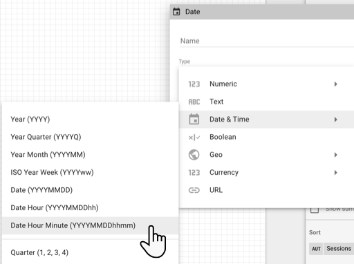
Note: using this data type can greatly increase the number of rows (cardinality) in your charts, which can affect the performance of your reports. We recommend limiting the date range to a single day, or using filters to reduce the amount of data displayed.
Override data source parameters in the report URL
Report editors can now modify default values in a data source. Overridable parameters make data sources more flexible, and give you a way to create user-configurable report templates. Learn more in the developer documentation.
August 16, 2019
Product updates
New report and data source headers
We've simplified the report and data source headers by grouping sharing-related options under the Share menu:
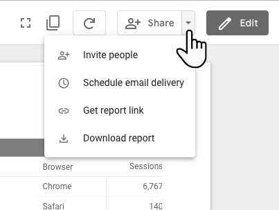
Use this menu to invite people to view or edit your files, schedule email delivery, get a link to the report, or download the report to PDF.
Documentation updates
Use blending to reaggregate data
Reaggregation is the process of aggregating already-aggregated data. Reaggregation is a common need in data visualization. This article will help you understand the concept of reaggregation and how to achieve it in Data Studio using data blending. Read now.
Function reference update
We've added to and updated the calculated field function references.
August 8, 2019
Product updates
Table drill-down
You can now drill down in tables. Learn more.
Image drag and drop
You can now drag images directly from your hard disc to the report canvas. Learn more.
August 1, 2019
Product updates
Automatically update extracted data sources
You can now automatically refresh data in an Extract Data data source by enabling “Auto update” and setting a refresh schedule. With scheduled data refresh, Extract data sources are a great option to improve the performance of your report.
Default value for multi select filter control
You can now set a default value for multi select filters. To set multiple default values, comma separate the values.
Linebreak support in tables
We now support line breaks in tables. Make sure text wrapping is enabled to see the line breaks respected in your table values.
Scrollable text component
You can now scroll to see additional text in the text box component. To enable scrolling, select the text component and change the “Overflow settings” to “hidden”.
July 18, 2019
Product updates
Treemap chart
You can visualize your data in a treemap chart. A treemap shows your data organized into dimension hierarchies. For example, you can use a treemap to show the average annual sales of each item in a product category > subcategory > product hierarchy. Learn more about treemaps.
July 11, 2019
Product updates
Compare to max
You can now compare the data in a chart to the maximum value for that field:
- Percent of max shows the current row's value divided by the maximum value for that field.
- Difference from max shows the current row's value minus the maximum value for that field.
- Percent difference from max shows the current row's value minus the maximum valuefor that field divided by the total for that field.
Learn more about compare to max.
June 27, 2019
Product updates
New home page
You'll now see a more streamlined home page. The new Data Studio home page is now similar to other G Suite products, like Google Drive, making it faster and easier to find and create your Data Studio files. Learn more.
New text functions
You can now use these functions in your calculated fields in reports and data sources:
CONTAINS_TEXT— Returns true if the specified text is found in the field or expression, otherwise returns false.STARTS_WITH— Returns true if the field or expression begins with the specified text, otherwise returns false.ENDS_WITH— Returns true if the field or expression ends with the specified text, otherwise returns false.LEFT_TEXT— Returns a number of characters from the beginning of a specified string.RIGHT_TEXT— Returns a number of characters from the end of a specified string.
Learn more about text functions.
New Ads dimension
The Google Ads connector now provides the Added Audience dimension.
June 20, 2019
Product updates
Pivot table improvements
You can now create pivot tables without a column dimension (leave the column dimension blank, or remove the column dimension if there is one). And, you can now create pivot tables with more than 2 row dimensions. Learn more about pivot tables.
Drill-down improvements
You can now specify a default drill-down level in your charts. This lets you set the level of detail to show viewers when they first open your reports. Learn more about drill-down.
Bidding, social, and geo fields in Search Ads 360
The Search Ads 360 connector now provides bidding, social, and geo fields. Learn more about connecting to Search Ads 360.
Show the list of new fields
- Ad ID
- Ad title
- Advertiser ID
- Agency ID
- Airport name
- Arrondissement name
- Autonomous Community name
- Bid group ID
- Bid Strategy Algorithm Control
- Bid strategy average target CPA
- Bid strategy average target ERS
- Bid strategy average target ROAS
- Bid Strategy Conversion Delay
- Bid Strategy Conversions Due
- Bid Strategy Conversions Total
- Bid strategy goal
- Bid strategy optimal cost due
- Bid strategy optimal cost total
- Bid strategy revenue due
- Bid strategy revenue total
- Bid strategy status
- Borough name
- Budget group
- Canton name
- City name
- City Region name
- Congressional District name
- Cost per page like
- Cost per post comment
- Cost per post engagement
- Cost per unique link click
- Country name
- County name
- Department name
- DMA Region name
- Governorate name
- Location
- Metro name
- Municipality name
- Neighborhood name
- Okrug name
- Page likes
- Post comments
- Post engagement
- Postal Code
- Prefecture name
- Province name
- Region name
- Social clicks
- State name
- Territory name
- TV Region name
- Union Territory name
- Unique link clicks
- University name
June 6, 2019
Product updates
Report editor improvements
We've improved the way you add charts to a report. Charts now appear wherever your cursor is positioned, and you have the option of clicking to place the chart at the default size, or using drag-and-draw to use a custom size. See this in action here.
In addition, you can now add lines and arrows to your reports. The line tool lets you create lines of varying styles, including arrows and connectors. Learn more.
New default behavior for the component header
Back on April 18, 2019, we announced the component header. With this release, the default behavior is to show the header "on hover." Previously, on hover was turned off by default.
May 30, 2019
Product updates
BigQuery connector parameter support
You can now use parameters in BigQuery data sources to override default values in custom queries. Learn more about data source parameters, and how to use them in BigQuery data sources.
More connectors support 20 dimensions in tables
The following connectors now also support up to 20 dimensions:
- MySQL
- PostgreSQL
- Cloud SQL for MySQL
Documentation updates
The table reference now correctly describes the number of metrics allowed in a table (20).
May 23, 2019
Product updates
Improved page links
You can now more easily link to pages in your reports. Use the text control to create a hyperlink, then select either a specific page in the report, or use dynamic link such as first page, next page, previous page, or last page.
More dimensions in tables
Tables using the following connectors can now have up to 20 dimensions:
- Google Sheets
- Google BigQuery
- File Import
- Google Cloud Storage
- Extracted data sources
- Blended data views
Tables based on other data sources can have up to 10 dimensions.
May 16, 2019
Product updates
Sort data source columns
You can now sort the columns by descending or ascending order in your data source by clicking the column headers.

May 2, 2019
Product updates
Community visualizations as filters
You can now create community visualization with the ability to act as filters. Learn how in the Developer Documentation.
April 25, 2019
Product updates
Advanced date comparison
You can now create advanced date range comparisons. This lets you align your current reporting period with the comparison period. For example, you can now compare the last 30 days to the 30 days prior to that and align the comparison Monday to Monday.
Chart drill-down
Drilling down gives viewers a way to reveal additional levels of detail within a chart. You can now define drill-down hierarchies in Cartesian chart to make it easier to find insights at various levels of detail in the data.
Hide page in view mode
You can now hide pages in view mode. You might want to do this if a page is under construction or contains information you only want other editors to see.
Documentation updates
Introduction to aggregation
This new article helps you understand how Data Studio groups and summarizes your data.
April 18, 2019
Product updates
Faster BigQuery reports
You can now use BigQuery BI Engine to improve the performance of reports that use BigQuery data sources. BigQuery BI Engine is a fast, in-memory analysis service that allows you to analyze data stored in BigQuery. Learn more.
New customizable component header
Use the Style tab > Chart Header option to control the visibility of the component header. The component header contains options for exporting data, sorting, and shows whether the charts is being accelerated by the BigQuery BI Engine.You can choose to show the header always, never, or on hover.
March 28, 2019
Product updates
Improved table formatting
It's now easier to resize table columns in edit mode. In addition, you can apply left, right, or center alignment to table columns.
Resize columns
Clicking and dragging a column divider now resizes only that column. To resize multiple columns at once, hold the Shift key while dragging a column divider.
Right-click a table to automatically size columns to fit the data or to size all the columns widths equally.
Column alignment
Use the options in the table's Style properties panel to set the alignment for the selected dimension or metric.

Google Attribution 360 connector is now called TV Attribution
The TV Attribution connector allows you to access television attribution data within Data Studio. Learn more.
March 21, 2019
Product updates
Customize canvas size per page
You can now control the canvas size for every page of a report. The Canvas Size option in the Layout panel sets the default canvas size for the report, but you can now override that on individual pages:
- Edit your report
- Select the Page
Current page settings
- Change the Canvas Size option from Auto to your new desired canvas size.
March 7, 2019
Product updates
Version history
You can now see what’s changed in Data Studio. Version history lets you view and restore previous versions of a report or data source.
Schedule email delivery of reports
You can now send a PDF version of your Data Studio reports to yourself and your stakeholders on a regular basis by setting up an email delivery schedule.
Custom rolling dates
Custom rolling date ranges let you configure custom date periods that meet your specific needs. For example, you can create date ranges such as "last 90 days from yesterday" or "last 52 weeks from last week." This option is available for both report editors, and for viewers of reports that include a date range control.
Get a report link
You can now get a short link to a Data Studio report to share, use in web pages, or do anything else you can do with links.
- View or edit the report.
- In the top right, click
.
- Click COPY LINK.
Documentation updates
We've done even more rewriting of the documentation on working with dates and time.
February 7, 2019
Product updates
New axis font size and data label font size settings
You can now control the font size of chart axis labels and data labels. These new settings are available for bar, line, scatter, and area charts. To access the settings, edit your report, select an appropriate chart, then in the STYLE tab, scroll down to the Grid section. (Show or hide data labels using the Show data labels option at the top of the STYLE tab.)
Image legend:
- Data labels
- Axis labels
Show missing data as blanks
The Missing Data option now lets you show missing data in tables as blanks. Other options include showing "no data," showing zeroes, showing "null", and showing hypens ("-").
January 31, 2019
Product updates
PDF download includes refinements
You can now download to PDF reports that include viewer refinements, including filter controls, date ranges, table pagination, and data control settings. This makes it easier to share customized Data Studio reports with offline stakeholders.
Additional chart-level aggregations
You can now apply the following aggregation methods to metrics in your charts:
- MEDIAN
- STANDARD DEVIATION
- VARIANCE
January 24, 2019
Product updates
Custom date comparison
You can now compare custom date ranges in your charts. Custom date comparison lets you compare the currently selected period to another custom period. By default, the comparison period is fixed, meaning the chart always compares to the exact dates you specify. You can change this so the comparison range is a rolling date window that advances over time.
Virtual Private Cloud (VPC) support
BigQuery data sources can now connect to data managed by Google VPC.
Documentation updates
We've rewritten and consolidated the documentation on working with dates and time.
January 17, 2019
Product updates
Graphing negative numbers is now easier. Cartesian charts now default to using the (auto) setting for the minimum axis value option. This option provides better support for charts that display negative or mixed numbers. Learn more.
January 10, 2019
Product updates
New function: APPROX_COUNT_DISTINCT()
- BigQuery and Cloud Spanner data sources now explicitly support the APPROX_COUNT_DISTINCT function in calculated fields.
- Previously, calculated fields in BigQuery data sources that called COUNT_DISTINCT actually used APPROX_COUNT_DISTINCT behind the scenes to reduce query costs. Now, COUNT_DISTINCT uses the actual count distinct function. To return to the previous behavior, change your calculated fields to use APPROX_COUNT_DISTINCT.
- For data sources which do not support APPROX_COUNT_DISTINCT, APPROX_COUNT_DISTINCT will act like COUNT_DISTINCT.
Bug fixes
- We fixed a bug that caused report level components to not be saved with reports under specific circumstances.
- We fixed a bug that impacted a small number of reports created or edited between January 2nd and January 4th, 2019.
- We rolled back existing reports that were affected by this bug to their January 1, 2019 state. To request your report to be restored to its January 9, 2019 6:00 PM Pacific Time version, please use this form.
- New reports that were affected during this time were corrupted and can't be opened. However, report editors and owners can make a copy of these reports, which may fix the problem.